
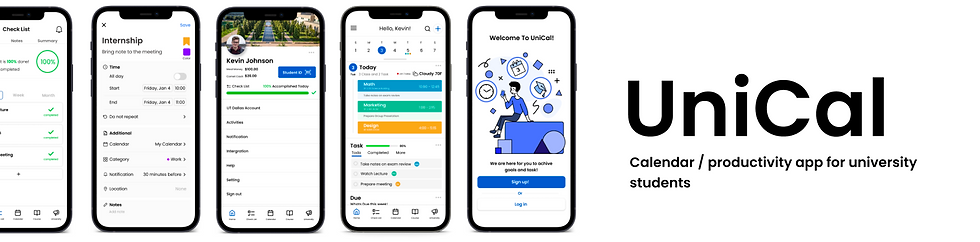
Project Brief
This project is to create an app that can create a schedule, create a to-do list, link university calendar/events / academic to the app, and share your calendar with others. This app will help students keep track of due dates/announcements from university, create and share the schedule with others to be more productive with friends, and create notes and a to-do list to become successful in University. I decided to create this app because I had a hard time keeping track of my university and personal life since it was on both different platforms. All my close friends had to stick to one or not use it at all since there was no perfect app for productivity. So I decided to create the app and it was a great journey. I was responsible for conducting user research, creating a persona, and usability test, and creating low and high fidelity prototypes.
Project Overview

Problem
Some users do not use the calendar app / productivity app because it is difficult to use / learn, features that a particular app did not have or all app is in a separate platform

Goal
Design an app for scheduling / to do list and other useful features that allow users to create events with ease and learn more about how to be more productive and successful

Project Detail
My Role : UX Designer
Responsibilities : User research, wireframe, prototype, etc.
Product Duration : The Project took 2 months for interview, designing, prototype and documenting progress
User Research
To create an app, first I need to learn how users use the productivity / calendar app and what are the pain points (what is stopping them for using it) users have. So first step was to interview the participants.
Interview Detail
1. Five Participants that attending to university currently or in the past.
2. Participants that are actively using or used productivity / calendar in the past.
3. Time duration : 2-3 weeks
4. Method : In-person / Phone call
5. Example Questions :
-
What app or method you use to be more productive?
-
What do you like / dislike about it?
-
What did you use in the past and reason why you not using it anymore?
and more follow up questions to go into details.
After interview....
I collected the data and created two features to make it easier to see and understand the perspective of the participants. Empathy Map and Affinity Diagram
Empathy Map
By creating an empathy map, I can deep dive into users' points of view and analyze data to create insights. This empathy map is divided into 4 sections. Thinks, Feels, Does, Says.
- Thinks / What users think about calendar and other productivity app
- Feels / What users feel when using the apps
- Does / What users do in the app
- Says / What users said during the interview

Affinity Diagram
Affinity Diagram is a way to organize information and gather common themes from the interview answers. For this project, I collected the answers and created a category of features the participants wanted in the Unical and this is the diagram.
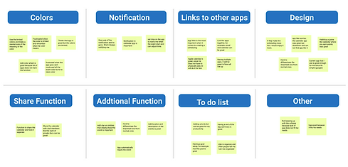
Insights
Insights / theme
- Simple design
- To do list
- Apps (email) link
to the calendar app
- Color is important
- Notification is important
Pain Points
Stressful when adding events
Color is limited
Apps can not link to the calendar
No function of shareable app
Less customizable
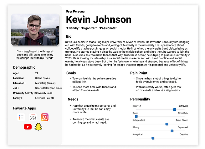
Persona
I created a persona which represents the 5 participants that share similar needs, problem and thinking.
Ideation
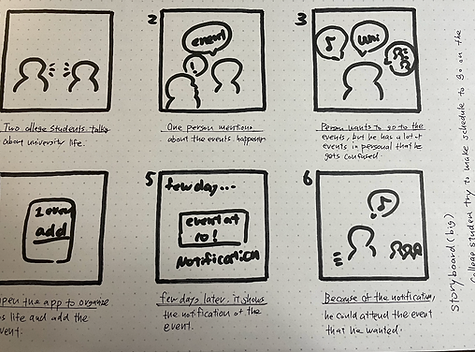
With all the information I collected, found insights, and created a persona, I began the ideation phase. This is the most difficult challenge because of creating a solution for the problem that participants and translating that into the design. It will be difficult to create a prototype from the start, so in order to come up with ideas, first I started the process by creating 2 storyboards and a "crazy 8" ideation exercise. The Big picture Storyboard (to understand pain points) and Close-up storyboard (to gain the point of view of the users using the app features) and crazy 8 (coming up with 8 ideas in 8 minutes of function of the app)
Big Picture Storyboard
Close-up Storyboard
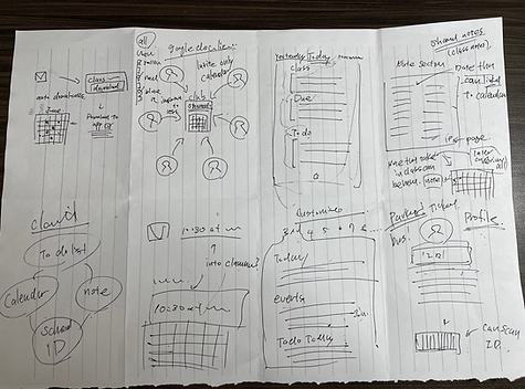
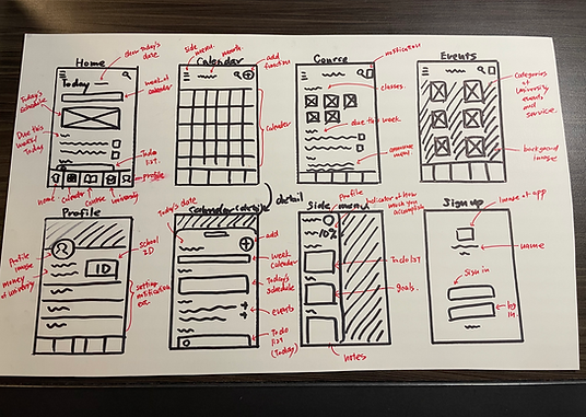
Paper Wireframe
Next step is to design the app itself! In order to achieve a great design, I sketched design, coming up with multiple ideas and design. After, I selected the best sketch that is a simple and functional design.
Top : (From left to right)
1. Home Page
2. Calendar Page
3. Course Page
4. University Event Page
Bottom : (from left to right)
1. Profile Page
2. Calendar Page (Detail)
3. Side Menu Page
4. Sign up Page
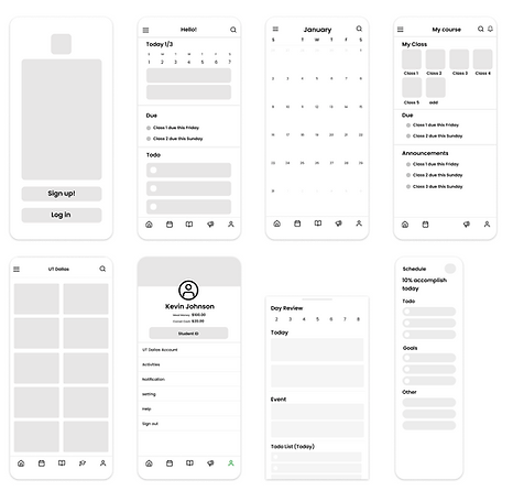
Digital Wireframe / Low Fidelity
Based on these paper wireframes, I created a digital wireframe and Low fidelity prototype. I used Figma, an UI design app to create these designs.


Usability Testing Part 1 / Redesign
After creating extra features and an interface to make it "usable", I conducted the usability test with participants from before. For the first usability test, I focused on the overall functionality of the app. I collected the highlighted feedback and came up with insights.
Feedback 1
"There is no security on the student ID. Feel unsafe to have ID without verification"
Solution
I created a feature where once the user click on the Student ID, it will require a pin number in order to access Student ID


Feedback 4
"To have a feature where app will input the university event automatically, so I don't have to"
Solution
Created a feature that will link to the University website (with user Login) and automatically add to the calendar
Feedback 2
"Having a to do list on the side is too inconvenient. Having a separate page will be better"
Feedback 3
"Having a progress bar in the app will be the best. So you know where your at"
Solution
Created a separate page for the to-do list and includes progress bar so it is easier to see

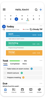
High Fidelity Prototype
After conducting part 1 of usability test, I created a more detailed prototype with more features, so that it will look "Lifelike". The prototype includes colors, buttons, animation, icons, images, and more. It was a great opportunity to explore features and colors and to learn new skills.
Before the Feedback
After the Feedback

Usability Testing Part 2 / Redesign
For part 2 of usability test, I was more focused on the visual element and design. For example, the icon, color, text size, overall flow and more. It was a great to get feedback, especially on the visual because I can get real feedback from participants who uses a variety of apps on daily bases and this was the highlight of the feedback
Feedback 1
"Overall color of the app is confusing. Sign in is colorful but the home page has none of the color"
Feedback 2
"Having a to do list on the side is too inconvenient. Having a separate page will be better"
Solution
I created a feature where once the user click on the Student ID, it will require a pin number in order to access Student ID


Feedback 3
"Maybe having a singular or similar color overall through out the app will be good to have"
Solution
See the overall design to more simple and functional. Made the over flow, colors and visual elements more clear and consistent through out the app.
Feedback 4
"It is hard to see the progress bar and the placement is awkward on the profile page"
Solution
Made the progress bar more simple and easy to look at. It is connected to the Checklist where you can see all the task and progress.

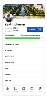
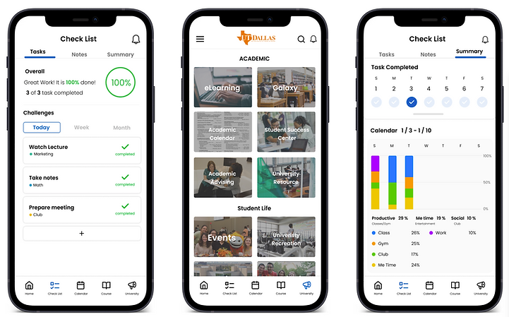
Final Design
Based on usability testing, getting feedback, redesigning, adding new features, and more, it took me a while but I finally finished the task, and here is my final design for Unical.


Demo Video

Sign in to Home Page
1. Sign up
2. Select an institution
3. Select class
4. Select color
5. Select other calendar apps
6. Home

Explore the App
1. Home
2. Checklist
3. Calendar
4. Course
5. University
6. Side menu

Check List Feature
1. Tasks
2. Notes
3. Summary
Notification / Widget

1. Share calendar
2. Notification
3. Widget
4. Widget 2
5. Email
6. Android

Creating Event
1. Add Event
2. Color selection
3. Details
4. Save

Test the Prototype
Click the image to test the prototype, Enjoy!
#Click the blue squares to interact once on Figma
Conclusion
This project was a great experience to enhance my skills and have more experience with the design process. From researching, interviewing, and ideating, this project made me think more about empathy and accessibility. But I have a lot of things to learn and challenges that I have to overcome. Thank you so much for the visit!